New signage on British American Tobacco buildings in Switzerland and Germany
New logo, new colors, British American Tobacco has changed its visual identity and commissioned us to design the new signs for the factories in Switzerland and Germany.
The new logo consists of 3 initials B A T and a comma which reflects the new identity.

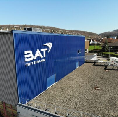
White logo on a blue background at the Boncourt factory (Jura) in Switzerland.
For the Boncourt factory, we created a white sign 7 m wide and 3 m high which took place against the blue background of the main building of the factory.
The frame of the sign is in white powder-coated aluminum and the front face is in opal white acrylic glass for front lighting.
We also produced a non-illuminated white sign for the annex building of the factory and two non-illuminated blue signs which adorned the white walls surrounding the visitor reception staircase. All made of folded heat-sealed aluminium.
We really liked the new identity and we are delighted to have been able to realize it.
We greatly appreciated the contact with the team responsible for the project at British American Tobacco and we thank them warmly for the good communication.
Our team of installers worked a full day to install the four signs before heading to the Bayreuth factory in Germany to install their new signs.
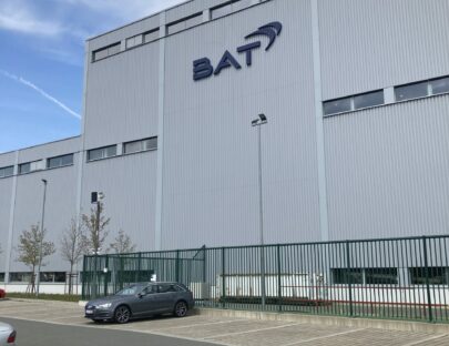
Blue logo on gray background at the factory in Bayreuth, Germany
In Bayreuth, we made a blue thermo-lacquered aluminum sign without lighting, 2.50 m wide by 1.80 m high.The blue paint was made to measure in exact correspondence with the pantone reference of the graphic charter.

New light signs for the Point Vert stores, a big breath of fresh air in the garden center sector

New way of designing light signs thanks to new manufacturing techniques
The LM Enseignes team is very professional, meticulous and punctual with excellent monitoring of all stages of the process. They make proposals and are solution-oriented.
The quality to price ratio is excellent. The final rendering is spectacular with a 3D effect that really highlights our logo.
The transformation has been so great between 2D and 3D it is definitely a positive differentiator in a dense commercial area like Conthey.


